Scoop
Evan Woodruffe opens new exhibition at Te Whare Toi o Heretaunga
Hastings Leader
27 Apr, 2023 09:26 AM
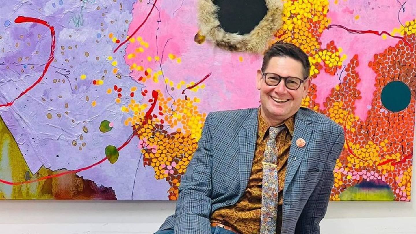
Evan Woodruffe is ready to show off his No Straight Lines art exhibit in Hastings. Photo/Supplied
Evan Woodruffe is set to wow Hastings with his new No Straight Lines exhibition at Te Whare Toi o Heretaunga.
The Auckland-based artist has spent the past six months working on an enormous new work to occupy the main wall of Hastings City Art Gallery.
Made up of six canvases, the large-scale work is nearly 3m high and 11m wide, to occupy as much of the viewer’s vision as possible so that they will almost feel like they’re inside the painting, Woodruffe said.
“This work has a beginning, middle and end, and can be read as a cycle of seasons, or life, or some similar process. It plays with the idea of illusionistic space we can move into and through, and with a work that is just about paint and what paint might do,” he said.
No Straight Lines paintings comprise a wide range of techniques, including collage, airbrush and drawing, as well as painting. His works are a riot of colour, though his newer work is more sparse in detail.
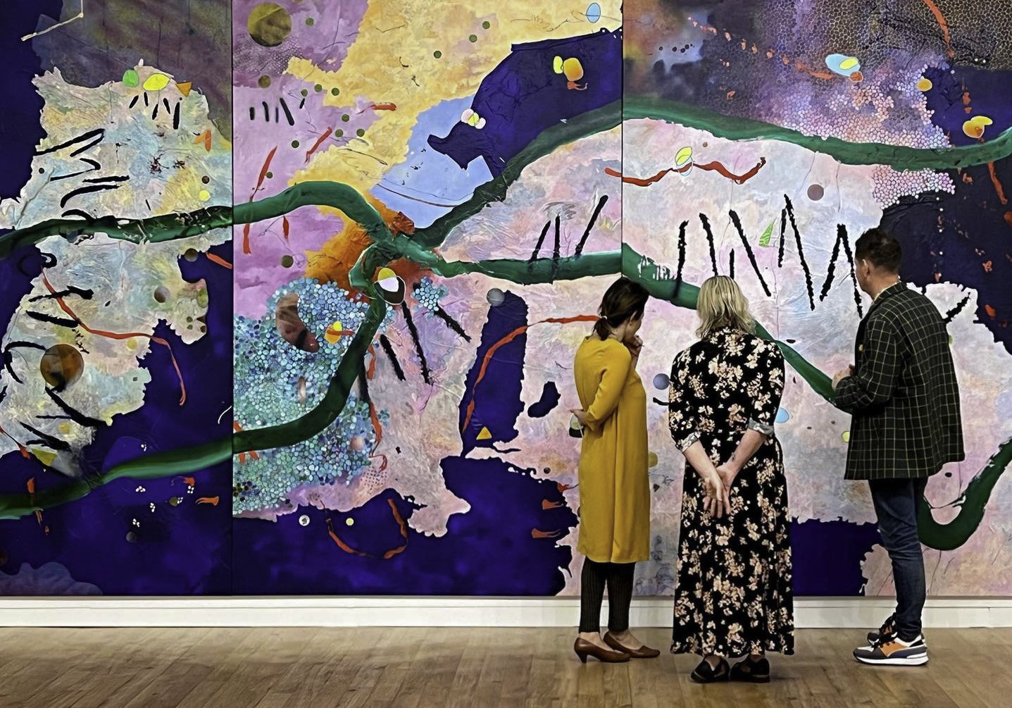
Evan Woodruffe shows his 11-metre-wide art installation to Hastings City Gallery Staff. Photo / Supplied
“Each colour has its own tonality, like a musical note. By combining certain colours, I can compose in a particular way, just as a collection of notes creates a certain piece of music.
“The colour combinations I use feel right to me, they make a painting feel right for this world. I’m trying to create a sensation,” Woodruffe said.
At the beginning of the pandemic, Woodruffe struggled with his use as an artist before coming to the conclusion that the uselessness of an artist in a practical sense was in fact the worth of the artist.
He said the worth of the artist was to “provide a laugh to crack the tension, to entertain us out of ennui, and to give us a sense of perspective against the drudging routine by showing us the long joyful kaupapa of art. This realisation drew me to more open, free spaces.”
As a result, Woodruffe is sensitive to what it means, as an artist, to bring work to Te Matau-a-Māui, while its residents are still dealing with the aftermath of Cyclone Gabrielle and said he feels privileged to do so.
“With the main work and assistance to this community done by our frontline workers, iwi and council, and welfare agencies, as an artist, I am only able to bring some colourful spaces to wander through,” Woodruffe said.
Woodruffe said when the hard mahi has been done day after day, when the head and heart are stressed and not coping, art offers a place for us to escape into.
“I bring this work to Heretaunga to offer somewhere else to be, even if just for a few precious moments.
“Art can transport us out of our everyday existence, give us some respite from our routine, remind us of the long, positive traditions we have as humans, and deliver us back to the present refreshed and better able to face another day,” he said.
To hear more about No Straight Lines, by Evan Woodruffe, there are free-entry opening celebrations at Hastings City Art Gallery on April 28, at 5.30pm.
Woodruffe will also give a talk about the work on Saturday, April 29, at 11am.
Te Whare Toi o Heretaunga – Hastings City Art Gallery is open from 10am to 4.30pm, Monday to Saturday, and from 1pm to 4pm on Sundays and is free entry.
Source link: https://www.nzherald.co.nz/hawkes-bay-today/news/evan-woodruffe-opens-new-exhibition-at-te-whare-toi-o-heretaunga/7QZEG2DDZJBY3FT3VVRGYAW5WY/
100 Sculptors of Tomorrow features Virginia Leonard
Virginia Leonard’s sculpture curated at the Dowse Art Gallery, October 2019, courtesy of PAULNACHE
PAULNACHE is thrilled to announce Gallery artist Virginia Leonard is featured in '100 Sculptors of Tomorrow', a new book by Kurt Beers, founder and director of BEERS London gallery, published by world renowned publishers Thames & Hudson.
Beers discusses his new book that celebrates sculpture and opens up the definition of the medium.
“I think sculpture is a slower burn that painting. A harder sell, but incredibly powerful medium. Virginia Leonard is one powerful example…her work is so poignant and personal…”
You can read the full interview online, click here.
—
https://100sculptorsoftomorrow.com
Design and maximalism: the anti-Minimalist movement
There is no doubt that the world of architecture and interiors has been under the calming, ordered influence of modernism and minimalism for a long time. Especially in Australia, the majority of designers prefer clean lines, simple colour palettes and form follows function – there’s even a magazine about it. But if you sometimes like breaking rules and shaking things up a bit, Maximalism may give you the licence to follow your patterned dreams.
Maximalism is a direct response to Minimalism – it layers bold pattern and colour on top of each other. Fabulously expressive, Maximalist interiors and designs offer the designer to get really creative – to explore play and to indulge in an orgy of extremes.

Drake Commissary in Toronto, mural by artist Alex McLeod. Photo: Toni Hafkenscheid
The Drake Commissary in Toronto includes the work of a number of artists in an evolving exhibition called “Fast Forward”. Most spectacular is a huge mural by artist Alex McLeod called Ancient Hills, which spans 10+ metres and depicts an incredible fantasy landscape created using 3D modelling tools. Other works include textile works, sculptural pieces and video art.
In Amsterdam, another hospitality interior going all out on Maximalist style is Bar Botanique, which includes layers of green planting, pattern and colour, designed by Studio Modijefsky. While much of the colour here derives from the theme, the interiors also include surprising elements like butterscotch velvet seating and geometric mirrored hanging artworks that make this a Maximalist joy.
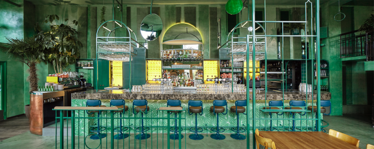
Bar Botanique in Amsterdam, designed by Studio Modijefsky. Photo: Maarten Willemstein
In 2017 in Milan, Corian presented “Corian Cabana Club: Exploring the World of Maximalism”, a display of creativity with seven cabanas made up of seven maximalist scenes. The most popular of these was a Mexican Bedroom styled by Antonio Marras in collaboration with Paolo Bazzani, which was inspired by this quote by Frida Khalo: “I paint flowers so that they will not die”.

Mexican Bedroom at Corian Cabana Club. Photo: courtesy Corian
In Australia, our most famous Maximalist designer is probably Catherine Martin, whose aesthetic can be seen in Baz Luhrmann films including Romeo and Juliet, Moulin Rouge and The Great Gatsby. More recently, her textiles ranges for Mokum show that she is not afraid of pattern.
Another Australian with a love for pattern is Greg Natale, whose new book The Patterned Interiorlooks to be serving up some amazing interiors on the Maximalist side of design. We can’t wait to see more.
Barwon River House by Greg Natale features in The Patterned Interior
But interiors are not the only place for Maximalism. In fashion, the layering of pattern and colour has had a revival, inspired by icons like Iris Apfel who said: “If you put something on and it doesn’t look good, the fashion police aren’t going to come and take you away. And if they do, you might have some fun in jail. The fun of getting dressed is that it’s a creative experience.”1
There are many fashion designers who are now making clashing outfits work. I am a huge fan of Belgian designer Dries Van Noten because of the incredible patterns in his pieces and the way he layers textures, pattern and colour, best seen in his Autumn 2017 collection. Check out his recent book celebrating his 100th collection Books 1-100.
From Books 1-100 by Dries Van Noten.
In ceramics, New Zealander Virginia Leonard‘s incredible expressive style is so far removed from the pristine ceramics we are used to seeing. Oversized, unsymmetrical and oozing with life, they are Maximalist objects each and every one, and look terrific in a group.

The work of ceramicist Virginia Leonard at Melbourne Art Fair 2018. Photo: courtesy the artist
In furniture, Design Academy Eindhoven graduate Kostas Lambridis‘s giant oversized cabinet is made up of a series of contrasting styles and finishes, in a nod to postmodern pastiche reborn as Maximalism. I wonder what he will design next.

Cabinet by Kostas Lambridis
Just researching this story has been amazing fun, and I could keep on going forever. If you are keen to see more, I can recommend you take a look at the Mondrian Hotel in Doha by Marcel Wanders, Studio Job’s new Headquarters in Antwerp, the work of New York interior designer Alex Papachristidis and this Texas Mansion by Miles Redd. Also, read these fun articles: “10 signs you might be a maximalist” by Apartment Therapy and “Maximalists, Rejoice: Here’s How to Keep Your Space from Looking Sloppy” by Architectural Digest. Here’s hoping we see a few more of these fun interiors in Australia soon.
http://thedesignwriter.com.au/design-and-maximalism/
On the Edges: Tairāwhiti Gisborne
Struggling to explain to people at international art fairs where exactly Gisborne is, Matt Nache of Paul Nache Gallery has settled on telling them he is from the future: “I wake before you, I eat before you, I dream before you. The first city to see the sun in the world, I live in the land of light,” is his pitch.
This mystic way of explaining the world Nache says amplifies why he chooses to live in Tairāwhiti, or Gisborne.
Always moving, yet making isolation a strength also marks out Matt Nache’s quite extraordinary practice as a contemporary art dealer. His gallery Paul Nache, established in 2009, is Gisborne based, but also highly mobile, representing artists from around New Zealand, Australia and even Las Vegas. Gisborne affords Nache a nice big light-filled space in the middle of town to exhibit, but he’s just as likely to be elsewhere - most recently showing Wellington based, Tolaga Bay-born artist John Walsh’s paintings at Art Central Hong Kong. Nache will be at the Sydney Contemporary Fair in September.

Nache has entrepeneurial flair and cheek to burn but its coupled by a strong appreciation of artistic excellence and what is good dealer practice. It seems matched by a generosity and grounding in his place, which sees plenty of local activity at the gallery as well. It’s no easy thing to hold both local and global positions as an art dealer. Out in the world the gallery exists more as a brand.
“The nature of a gallery space has evolved,” says Nache, “whether it’s a physical museum or gallery or an international art fair, a private residence or an online exhibition. It’s my job to provide the space for the artists to create in.
“The isolation of Gisborne allows me to keep resetting the focus of what I’m trying to do with artists - it is really hard to keep up with the bigger galleries and institutions. Gisborne gives me the time and freedom to rejig it.”
Gisborne was a natural place [for Nache] to return to after gaining a Bachelor in Design in Wellington. It’s his place of belonging.
“No matter what else happens I am myself here. It was important for me to reconnect. But it was a really difficult business decision to establish in a small provincial city. There hadn’t historically been a contemporary art dealer here and its highly unlikely there will be one after me. It’s a very slow progression in terms of the economy and population growth, especially one which could support creative industry.
“Gisborne is unique. It’s like Jurassic Aotearoa, you come here and get a sense of what New Zealand was like. I love the rawness and the purity of that. It teaches patience and perseverance. Exhibiting art here you don’t get away with much either, people are upfront and honest and don't hold back in their evaluations of new things. Artists and collectors will fly in on invitation from across the country and mix with our local audience and community, often for extended periods, due to our incredibly above average weather. It’s a really honest way of working. It’s a dynamic experience and I’ve proven with others that if it can work in Gisborne it can work anywhere in the world.”
Nache says that Gisborne is currently planning for the 2019 sester-centenary of Captain Cook's landing - the first meetings between Māori and Europeans. Local Iwi, Council and the Te Ha Trust, are fuelling a lot of creativity through open dialogue and initiatives, which is healthy for both the arts community and local economy to engage in.
“Taking the time and following the passion, that’s what survives out here.”
Interview with Matt Nache, exploring how New Zealand’s edges can also be our arts centres, written by arts writer Mark Amery.
Virginia Leonard's 'Christmas Time at Middlemore' Catalogue
“I have sought a voice for my own pain. These objects are my body”
The highly individual and evocative ceramics of Auckland artist Virginia Leonard are honest self-portraits that address her bodily scarring and experiences of chronic pain, injuries obtained in a serious motorbike accident in London in 1986. This event left Leonard hospitalised for two years and “changed and formed” the artist, which she recounts as having both a negative and positive impact. Confronting these issues, Leonard’s wonderfully experimental ceramic practice employs the flesh-like materiality and tactility of the medium, and the physical presence of the sculptural form, to forge a personal material vocabulary for her body’s scars and pain. As Leonard states, “chronic pain has no biological value. Modern medicine cannot reliably treat chronic pain. Chronic pain lacks both language and voice...the language of my clay making is my attempt to rid my body of trauma and reduce my level of chronic pain”. The results are unique, emotive, visually arresting ceramic works that stand like materialised acts of internal speech and sensation bursting forward in the fluidity and sloppiness of clay.
Following a successful painting career in New Zealand, Leonard started working with clay in 2013 - “The transition grew from my need to address my bodily issues. Clay became more visceral and bodily. It was oozy and clumpy. It resembled my scarred and jaggered leg. It’s also a precarious medium. You don’t know if the work is going to survive the high temperatures of the kiln. is reminded me of the fragility of my body”. Now working predominantly in raku and porcelain, Leonard is largely self-taught and her innovative ceramic practice is driven by the tactile material possibilities of clay for expressing and connecting with her body and chronic pain.
Discussing her process Leonard writes, “ there is always a strong narrative within the work and that narrative really depends on how my body is feeling on the day. This decides what happens to the work. Clay is an extremely material and emotions come into play easily when I am manipulating the clay”.
While ceramics is currently Leonard’s primary focus, the artist’s training as a painter is integral to her approach - “I treat the material of clay similarly to how I treat paint and painting...I move the clay like I move paint on a canvas. I make the material gestural when building my constructions... the rougher and more gestural the better. The closer I am to representing my broken body...But within this loose way of making I always have in mind the formal aspects of abstract painting”.
Leonard’s recent ceramic works evolve from a process of stacking, in which the artist piles random individual pieces on top of one another, a methodology she refers to as “building precarious towers resembling my human form”. Important to the development of the work’s stature is not only that it’s life size but also that it’s confronting and that it’s positioned at eye level with the audience. Also as Leonard adds, “layering the work and stacking the work also references surgery and the ability to hide my bodily scarring, the more I assemble the more there is to look at which takes the viewer’s eye away from the ugly bits”. In this encounter we are met by collections of nobly rounds, curiously human shaped vessels with deformed handles, prickly cones, and boxes fused shut with wonky lids. Each distinct element seems to be resting after contorting in spasms of movement, huddled together for support. Like the “maps” of injury that Leonard carries around on her body, these assemblages are often covered in rippling fields of spikes, oddly shaped nodules and rounds, and blankets of seeping, suffocating glaze. The artist also often inserts sharp objects such as shards and nails, alongside pieces of fur, to highlight surgery and her post-operative care.
As Leonard writes, “It comes from a memory in my early twenties lying in a hospital bed with an external fixator. The nails and bolts held my leg together. The fur protected my body from bed sores...it was pretty horrifying and I still remember it like yesterday. So the nails are very poignant”.
The glazing and ring are also fundamental to Leonard’s exploration of her body’s impairments, and how this might be reflected in the material vulnerability of the clay itself. As she outlines, “I’m very interested in pushing the clay and glazes beyond their limits, it seems to have become an important part of my process, work that has cracked and split just before breaking point or nearing collapse. It represents my broken body. Sometimes I do this on purpose other times they will crack and collapse on their own. This is always my favourite part of the process, I can’t control it”.
Leonard’s glazes echo her vibrant canvases, being amazingly painterly in application and demonstrating her understanding of palette and nuances of tone. The artist uses combinations of under glazes, stains, metallic lustres and resins, which are applied in sweeping, gestural brushstrokes or left to congeal in voluptuous drips, drawing our attention to the materiality of the glaze itself. Describing her glazing technique Leonard writes, “I overload the glaze with under glaze then re it at a high temperature. It creates a scarred, skin like texture over the body of the work”. Leonard also applies glazes unevenly to mimic the tonal characteristics of a landscape painting, resulting in a surface that shifts between areas of pale and heavy glaze, with some sections left to reveal the core of clay beneath.
As the artist discusses, “I consider light against dark. Textured areas within oxygenat- ed areas. Allowing the mark making to show through, allowing the making at all times to be on show... ring and re ring until the glaze appears old and with depth”. Colours often selected depending on the nished form and Leonard utilizes so er tones for stronger works to avoid the colour dominating the form. Palettes are often “slightly bodily”, like her esh like pink, smudgy whites, deep blood reds and purples.
These sit in contrast with shots of gold, luminous mother of pearls or hot pink and yellow. While blues, hand painted motifs or decals, reference the history of ceramics or are used to make the work appear more formal. Although, as Leonard explains “I will always rough it up a bit at the end. So I will push heavy blues over the top and make them drip and ooze”.
Leonard’s relationship to the making itself is what ultimately informs this artist’s compelling ceramic practice - “I think the most important thing for me is to trust my process as I am really not making work in the traditional way and if I begin to second guess myself the work becomes too tight and there-fore loosens its intention of been gestural and bodily...But I trust my process so I know something magical will come out of this in the end”.
Essay by Altair Roelants
Photography by Oliver King
Introducing Virginia Leonard
PAULNACHE is thrilled to now represent Virginia Leonard, a NZ-born and based artist who works with clay in a response to the broken parts of her body.
After graduating with a Master of Fine Arts from Whitecliffe College of Arts & Design in 2001, Virginia was the winner of the Molly Morpeth Canady Art Award, Whakatane (2012) and winner of the Walker and Hall Waiheke Art Award, Waiheke Art Gallery, Waiheke (2011).
Her recent exhibitions include: Graffiti Lounge, group show at PAULNACHE, Gisborne (2016); The Effects of Crack, Objectspace, Auckland (2014) and Foursome, The Vivian, Matakana (2014). Virginia won the Merit Award at the Portage Ceramic Awards, Te Uru Waitakere Contemporary Gallery, Auckland (2015); a consistent Finalist in the Wallace Art Awards and was a Finalist in the National Contemporary Art Award, Waikato Museum.
One should either be a work of art, or wear a work of art
IF, as Oscar Wilde said, “one should either be a work of art, or wear a work of art”, then “extraterrestrial” drag performer Elibra Fleur must be a masterpiece. Sidebar goes here
At least she will be in the hands of artist Evan Woodruffe who, as part of his Auckland Art Fair show with Gisborne’s Paul Nache gallery, plans to enfold her in acres of silk crepe georgette printed with his own colourful painting. And she’s bound to make an impact: at over six feet six (two metres) tall, Fleur certainly fills the gallery brief of creating an installation in which scale plays a crucial role.
“Scale is absolutely the key and that will be seen in how we squeeze in Evan’s giant paintings that really push the limits at every point,” says gallery owner Matt Nache of preparations for next week’s fair.
“Then its about how those paintings function in the space with the works of our two other exhibitors, (painter) Scott Gardiner and (sculptor) Glen Hayward. It’s going to be really exciting.”
Regarded as New Zealand’s international showcase for contemporary art, the Auckland fair last year took a break but the year before PaulNache attended, its drawcard being Las Vegas-based artist Matthew Couper giving live painting demonstrations — dressed in an ape suit.
But while Nache says performance art like that and Fleur’s appearance in her printed garment (designed by Steven Ball) adds to the “spectacle”, it’s the art that’s important.
That garment will, in fact, become a piece of art – forming a sculpture where Fleur leaves it puddled on the floor and, as well as his canvases, Woodruffe has also painted a striking vintage armoire, further pushing the boundaries of what is a painting and what is not.
Meanwhile, Gardiner — who recently relocated from Gisborne to Sydney — continues to test his painting practice of setting hard, linear structures against soft impressions of life and movement.
And Hayward develops even further his sculptural trickery, whereby he sculpts and paints what appear to be everyday objects, testing the viewers’ belief of what is or is not real.
All three artists have exhibited in Gisborne over the past year
All three artists have exhibited in Gisborne over the past year and Nache says that’s important to exploring how they work as individuals, and together.
“Their works are striking but there’s more to it than that. All three also have an intelligent, articulate way of speaking of their work to a broad audience so they can educate people about their works if they want to go that little bit deeper.”
Adding to his physical dealer gallery in Gisborne by attending national and international art fairs “is an opportunity to network and develop that global view”, Nache says.
“Our aim is always to put together an installation that is captivating but we also love to have an element of unpredicatablity and spontaneity,” Matt Nache says.
“What gets us excited is the oppor-tunity to create these ideas and use the art fair as a platform to launch the show both nationally and internationally to see how far we can take it.”
- The 2016 Auckland Art Fair is on at The Cloud (Queen’s Wharf) on May 25-29. Evan Woodruffe, Scott Gardiner and Glen Hayward present an artists’ talk at the Paul Nache booth A3 on May 28 (1pm).
ARTS by Kristine Walsh, The Gisborne Herald
Gisborne gallery joins rebooted Auckland Art Fair

Gisborne's Paul Nache gallery exhibits at the biennial Auckland Art Fair.
THE first time Gisborne gallery Paul Nache exhibited at the biennial Auckland Art Fair it did so with a show entitled '3 artists in 3 days'. The next time with an installation called 'Proud to commit commercial suicide'. Evidently [that] failed as, two years later, it was back with Las Vegas-based artist Matthew Couper giving live painting demonstrations — dressed in an ape suit. And this year it’s going back again, joining the Art Fair as it returns after a three-year hiatus.
Auckland Art Fair is regarded as New Zealand’s international showcase for contemporary art and, in an effort to build on that, decided to defer its scheduled 2015 event to secure a better position on the international arts calendar.
The decision was made after mega-fair Art Basel Hong Kong last year announced it would move to new dates, switching from May to March.
And that proved to be good news for Paul Nache, meaning it could this year show at both the Art Basel-associated Art Central event, in Hong Kong, and this year’s Auckland Art Fair.
For this year’s Auckland event, Paul Nache director Matt Nache has chosen to exhibit painters Evan Woodruffe (based in Auckland) and Scott Gardiner (now living in Australia), and sculptor Glen Hayward (Whanganui).
Fair co-director Stephanie Post says the selection process for 2016 was highly competitive, galleries chosen on the merit of their proposals by an independent selection committee comprising of gallery director Michael Lett, Auckland patron Dayle Mayce, Justin Paton (currently head of international art at Sydney’s Art Gallery Of New South Wales), Govett-Brewster Art Gallery/Len Lye Centre director Simon Rees, and arts commentator Hamish Keith.
“So we are thrilled to have Paul Nache on board,” she says.
“The gallery is a ground-breaking force on the New Zealand art scene and we are eager to see what they and their featured artists will surprise us with.”
- The 2016 Auckland Art Fair is on at The Cloud (Queen’s Wharf) on May 25-29.
ARTS by Kristine Walsh, The Gisborne Herald
Trouble on Mount Toiroa
TAUTINI’S DEMISE: Artist John Walsh has teased out an ancient Te Aitanga-a-Hauiti story for works shown in his first solo exhibition in Gisborne for more than 15 years. “I struggle to fill the commitments I already have,” he says, “but this time I pushed a few things aside to make sure the exhibition would happen.” IMG X Michael Hall courtesy of PAULNACHE and the artist.
THERE is trouble brewing in the lush, saturated bushlands of artist John Walsh’s imagination.
Known for eating the flesh of children in an effort to prolong his own life, Tautini — of Tokomaru Bay’s Toiroa Maunga — has made the fatal error of devouring the child of fellow chief, Tutemangarewa, who responds by cutting off Tautini’s head. Recent works by John Walsh opens at PaulNache at 6pm tomorrow (Friday, April 8).
But the carnage does not end there: Tautini’s daughter Te Aotawarirangi smears herself with blood, retrieves the decapitated head and incites her brother Tuterangikatipu to make war to avenge their father. It’s an ancient, gory story, but one that has a modern-day legacy in the Te Aitanga-a-Hauiti affiliated Anaura Bay marae Hinetamatea, named after Tautini’s wife.
And it was to Hinetamatea that Walsh — himself of Te Aitanga-a-Hauiti descent — headed when he was earlier this year invited to be artist-in-residence at a wananga held at the marae, where arts group Toi Hauiti was driving a project to build an imposing new waharoa (gateway). For him, it provided an entry to the stories of his ancestors, specifically that of Tautini and his interesting appetites.
“I’ve got no doubt that someone will get upset about the airing of this tale but that was not the intent and, in fact, the whole kaupapa of the wananga was to take ownership of and tell these unique stories,” he says.
“We would sit around and talk and one day one person would tell the story from their perspective, then the next day another person would come and as word got around, another person would come,” he says. “So each day I had a little bit more to add to the narrative.”
He doesn’t want people to be shocked or revolted by the story, he says, “but to be mindful that this took place in an isolated community, thousands of years ago”.
“If you look at it in that context it is almost understandable that, at a time when life expectancy was just 40 years, someone might be drawn to the idea of immortality. But who knows? All we have to work with is the stories we are told.”
Opening at Gisborne gallery PaulNache
The result of all that korero during the residency is a series of half a dozen dramatic paintings that make up a large part of the exhibition Walsh this week opens at Gisborne gallery PaulNache. Though the artist was based at the seaside marae, much of the imagery is seen from the maunga Toiroa itself, a lush, imagined bushland falling away into the ocean below.
But it’s not all rich greens and intricate, ancient pa sites: in some pieces Walsh has, uncharactistically, allowed himself a bit of “negative space” to give viewers room to contemplate specific images – the blood-smeared figure of Te Aotawarirangi; an open space in front of the whare where Tautini meets his demise.
Though the paintings are new in their content, Walsh says they are a continued reflection of his upbringing in Tolaga Bay and Gisborne, his home until 1993 when he moved to Wellington, where his trajectory as a collectible senior artist really took off.
In an (often unsuccessful) effort not to offend his iwi, Walsh has in the past constructed his own narratives and his own characters. “But it’s all been connected to here,” he says. “This is where it has always come from.” In any case, this time team Hauiti is really on board, from hosting the wananga where the artist developed his work, to coming up with the kai for this week’s exhibition launch.
Still, it’s not all about them and Walsh has also created works inspired almost entirely by place names — evocative titles like Mangatuna and Wharekaka. And another striking, central work illustrates a story about an ancient Scottish practice whereby an offender is set afloat in the sea near a gannet colony, an enticing fish tied to his head.
Grim prospects with gannets in sight
Their prospects were grim, Walsh says, gannets often dive on their prey from great heights and can hit the water at 200 miles an hour. And though it is a completely different narrative from the Tautini series, for the artist, the imperative to paint it was just as strong.
“When I heard this story the image just popped into my mind and I had to get it down,” he says. ‘I was totally drawn to this idea that justice could be such a swift and direct thing.”
Oral history is not an exact science, Walsh says, “but nor is any kind of history”. But in this new series he is telling his-story — the oral traditions his iwi holds as its own.
“I guess it’s a way of taking that chunk of ancient history and trying to fit it into a modern context,” he says. “It’s an exploration, a way of trying to see how things fit and what it can mean to us in our lives.”
ARTS by Kristine Walsh
Link: http://gisborneherald.co.nz/entertainment/2256637-135/trouble-on-mount-toiroa
Graffiti Lounge

Graffiti turns private into public: it places an individual’s expression onto a privately-owned space to display to the community their contest of space. Graffiti is a reaction against the visual occupation of public space by companies’ and individual’s use of advertising billboards and Brutalist architecture; graffiti is a direct action in the contest of ownership of public space.
With each exhibition, the white walls of a gallery are ‘tagged’ by a succession of artists’ works. However, rather than a contest of space between artist and gallery, it is a collaboration to contest the visual space of our culture. Gallery and artists work together to present and represent their ideal supremacy over the visual pollution that invades our everyday. Like graffiti, the exhibition is transient and fluid, with each one applied over the last, jostling for space and asserting ownership: graffiti and exhibitions grow in palimpsest.
Though serious in its challenge, the curation of this exhibition lounges; Gisborne in the height of summer is ground-zero for sauntering, and Graffiti Lounge reclines with a relaxed, confident attitude. It is not a clean, formal show, as it instigates a variety of aesthetics that reflect the chaotic nature of graffiti. Evan Woodruffe and Kimberley Annan have approached it with the method of graffiti crews, producing works separately and collaboratively, and inviting artists to join them in a show that contests the ownership of our visual space. Welcome to the Graffiti Lounge.
GRAFFITI LOUNGE ARTISTS:
Evan Woodruffe
Kim Annan
George Hajian
Sue Dickson
Virginia Leonard
Richard Darbyshire
Teresa Lane
Eloise Cato
Glen Hayward
CREDITS:
Film: Damon Meade
Photography by Tom Teutenberg @2TEN
Music: Melon Twister
PAULNACHE Productions © 2015
Evan Woodruffe: Assertively Decorative
Interview by John Seed Professor of Art and Art History, Mt. San Jacinto College
Evan Woodruffe, 1st July 2015, 1000 x 1000mm, acrylic on linen
Painter Evan Woodruffe, whose work is on view in the upstairs Graffiti Lounge of the Paul Nache Gallery in Gisborne, Aotearoa, New Zealand, thinks of his work as "assertively decorative." Woodruffe's stated intention as an artist is to present "a confused multiplicity of interconnected elements and surfaces that allude to our current urbanism."
The results are bold, spellbinding and literally dazzling.
John Seed Interviews Evan Woodruffe
Artist Evan Woodruffe - IMG X Tom Teutenberg courtesy of PAULNACHE, Gisborne NZ
Evan, you apparently come from a family of artists: tell me about them....
My mother, father, and two elder brothers escaped the class system of England (dad was born in London's East End), arriving in New Zealand in 1964. They brought very little out with them, but there were some paintings from both sides of the family: a watercolour of Woodbridge by great-great-uncle Charlie, and some peculiar garden scenes by my grandmother Aida Wormald, where she'd used watercolour with almost no added water, so they're composed of very bright resinous drops.
My father, John, had been trained in the late 1940s as a designer; one of his teachers was Alan Fletcher, the father figure of British graphic design. In those days, everything had to be hand-rendered, mainly in gouache, and dad still paints very skilfully in this medium. Vivienne, my mother, has a fabulously light touch with paint and pastel, but is too modest to show much. I'm very proud to have one of her keenly perceptive self-portraits.
My five siblings are all creative, from my youngest brother Lars, a film editor based in New York City, through Emil (motion-graphics), Kate (PR), Garnham (landscape design), to my eldest brother, Paul, who's been painting much longer than I have. I came to serious art-making later in life, having abandoned my first creative pursuit, music, when I got too old to be a young rocknroll animal.
Evan Woodruffe at work
Did you have any important mentors or experiences that shaped your art?
When I was eight, my parents took us to see Luc Peire's Environment III (1973), which had just been purchased by Auckland Art Gallery. It was a cube one entered, with a mirrored ceiling and floor; I could see myself reflected into infinity, receding forever down and up to an accompanying space-age soundtrack. I felt disembodied, like I was floating off into the artwork. It was an incredible feeling for me at that age.
In 2014, I stood in front of the massive Ngayarta Kujarra (2009) canvas painted by twelve Martu women from Punmu in Western Australia. Again, I felt like I was sucked in to the picture, transported to another place, and swore I could see figures moving in the pale central area.
Sometimes a picture can make me cry; the last time was a small work by Henri Fantin-Latour (d.1904), bequeathed to Auckland Art Gallery a couple of years ago. It was just some flowers in a vase, but they were so beautiful, as if they were tearing their fabric to enter our world.
There is an excellent book by James Elkins: Pictures and Tears (2001) that looks at this affect, which he calls trance theory: "People who cry in front of paintings are actually taken away: their motionless bodies remain in front of the paintings, but their thoughts are temporarily lost, even to themselves [...] they come back, shaky and unsteady, as if the trip back from the painting led across a narrow bridge suspended high over a gorge". Imagine making such a work? It must only happen to a few, and perhaps only once or twice, and by accident.
Evan Woodruffe, 23rd September 2015, 1800 x 2800mm, acrylic, pumice, fabric, wood, plastic and bronze on linen
Tell me about your influences: it looks like Aboriginal art is one, right?
The assertively decorative structure in my work can be linked to Aboriginal painting, though perhaps this is more a regional reference (one that I myself make). For while the traditional Western model tends to avoid the decorative in Fine Art, leaving it to applied arts such as textiles and ceramics, there are many contemporary artists who do employ its all-over effect: Chris Ofili, Ding Yi, Fred Tomaselli, and Philip Taaffe, for example. Taaffe has described using decoration to initially attract viewers, so that their attention can draw out deeper meanings.
There are also similarities with the cartographical aspect of the work: there is an archaic approach to map-making, where the Western aerial, topographical visualization is challenged with a more narrative description, a traveling-through approach which can be seen in many non-Western cultures, including Aboriginal. While Aboriginal painting is very specific about place, however, mine attempts to convey a more fluid idea of landscape, one that is less tied to geography.
In both painting and our environment, discovery comes from making a movement through it. The verb to invent comes from in-venire, to come across; so invention comes from maintaining a state of expectation while moving through an area, allowing the discovery of the new. Roberto Matta's approach opens up the way to an image through a series of 'accidents' or informal gestures, as in his painting Bringing Light without Pain (1955), and this is a constant influence in my process: what happens when one doesn't have control?
This 'coming across' the image I see also in Dorothea Tanning's paintings from 1957-63, especially in work like Dogs of Cythera (1963), where form begins to shape from a formless flurry of visual information; I love her ability to hold the viewer on the threshold of recognition.
While I understand Yayoi Kusama's infinity nets are for her a very real merging of psychic and physical realms, what I'm intrigued with is how they create a filter or screen that fluctuates with its uneven application, generating a rhythm across a surface. This is where my circles come from; for me, they become a permeable membrane that filters, transmits, and connects.
23rd September 2015 (detail)
How did you gain all of your technical knowledge of painting?
I grew up with art materials, and when my father left advertising to start an art supplies store when I was nine, this immersion increased. I began working there as a young man, but as music occupied my creative drive at the time, I decided to investigate the technical side of the materials. The store was dealing directly with a number of excellent German manufacturers, most notably Schmincke (colour) and da Vinci (brushes), so I was able to talk with people who were not only operating at the height of German excellence, but whose families had been making artists' materials for generations.
When I stopped playing music and began painting seriously, I was able to join the technical with the practical and began writing instructional booklets and articles. My understanding of artists' tools was extended by visits to various manufacturers both in Germany and the USA, and after my family sold the business to a large art supplies company, I kept a part-time role for training, demonstrating, and specialist marketing.
Evan Woodruffe, 15th August 2015, 1800 x 2600 mm, acrylic on linen
What are some of the ideas and images that inspire you?
In that 'landscape' is a manmade concept and therefore readily available as a metaphor, my work is fed by the idea that our landscape is once again a very baroque one. My understanding of landscape includes the washing hung out to dry in my apartment as much as the trees I see over the balcony. Anselm Kiefer said that one cannot paint the woods the same once the tanks have rolled through them; I add that one cannot paint them the same once the Broadband has been rolled out, either.
Our modern landscape includes history, fashion, technology, detritus. When I walk through my environment I see the sky, buildings, graffiti, people with tattoo, bright dresses, neon signs, trees, litter, motion, emotion - and I check my phone so whatever's happening in world is added to my experience. This is landscape now: a multi-perspective world of clarity and obscuration, fast and slow and totally baroque.
Living on some islands at the bottom of the Pacific, I'm interested in how our connection to the rest of the world is deliberated across water. Unlike the tangible nature of land, the ocean is ungovernable, and acts like an unpredictable site of negotiation. The Pacific peoples called the space between islands 'Va', a place of connection, trading, uncertainty, and flux. These values seep into my painting (my paints themselves water-based and fluid), to affect my decisions of colour, quantity and quality. I like the idea of a 'wet gap' that connects everything, rather than us all as dry, separate beings.
Evan Woodruffe, 27th July 2015, 1910 x 1075 x 430mm, acrylic, pumice, metal, glass, bone, string, gold and palladium leaf on vintage armoire (wood, glass, metal)
Have you always been an abstract painter, and are you in fact an abstract painter?
I think all painting is unnatural and abstract: with realism, the more one tries for the true trompe de l'oeil, the flatter and less like reality the surface becomes. Conversely, the more deconstructed or abstract an image, the more the eye tries to find a recognizable pattern in it, to return it to form.
When I began painting seriously, I decided that I would first need the skills to render things as I saw them. I'm not saying this is how it must be done; it is different for each of us. Once I knew how to paint something to look like that thing, at least initially, the great difficulty was - and still is - to break that habit. The more one becomes competent, the more one has to fight that ability in order to come across something new.
I think that these days to paint figuratively and transcend the abilities of photography and film, one must be really insightful, skilful, and brutal, at least in one's convictions and there are people who are more competent in this than me. A few years ago, I realised that I could excite myself to better results by dissolving the figure into its modern environment; the viewer became the figure in my work, and I attempt to create a shift in their experience of landscape through telling it in a more extra-ordinary manner.
27th July 2015 (detail)
Give me a little known fact about yourself.
There are so few, the ones that have remained little known should probably stay that way!
How is the art scene in New Zealand?
For a small island country, New Zealand (pop. 4.5 million) has a thriving domestic art scene. There are few who make their sole income from sales, with many also employed in teaching or arts-related jobs, but there is a healthy dealer gallery scene, backed by good public galleries and community art centres. There are a number of significant awards and residencies operating, the Auckland Art Fair attracts galleries from around the region, and New Zealand is represented at several Biennials, including Venice.
Operating from an archipelago far from the next landmass has its advantages: the distance filters the international art we see - we tend to see the best and miss the worst, so the bar we set ourselves is high. We are keen to get our work off these islands into the wider world, and so try to locate our work in a wider context. New Zealand galleries are regular participants at Melbourne Art Fair, Sydney Contemporary, Art Los Angeles, and Basel Hong Kong.
25th July 2015, 1000 x 1000mm, acrylic on linen
What are your interests outside of painting?
I like to eat, drink and dance with my friends and family. My partner and I love the delicate yet strong balance of flavours that make pre-1950 cocktails. Of course, if one is drinking there should also be good food made from fresh ingredients. Dancing helps shake of the effects of both!
We both need to travel overseas regularly. This country is a beautiful place to live in, but the isolation makes it essential to get off these islands once a year or so. Seeing how other peoples live opens our minds, and makes us appreciate home too.
I like the histories of small things and large. Everyone has some personal history, and all those individual stories combine to make culture. Listening to people tell their stories is fascinating.
Photos by Tom Teutenberg and Salt Akkirman
Current Exhibition
Group Show: Evan Woodruffe, Kimberley Annan, George Hajian, Sue Dickson, Virginia Leonard, Richard Darbyshire, Teresa HR Lane, Eloise Cato & Glen Hayward.
Graffiti Lounge (upstairs)
Paul Nache Gallery
89 Grey Street, Gisborne 4010
Aotearoa, New Zealand
February 5-27
Follow John Seed on Twitter: www.twitter.com/seedhuffpost
Melbourne painters Gisborne-bound

IMG X Tom Teutenberg
GISBORNE dealer gallery PaulNache is marking the start of the New Year by reaching over the Tasman to bring a pair of Melbourne artists to town. While both Matt Arbuckle and Merryn Lloyd are painters, there are myriad differences in how they use their medium.
A long-time associate of the Gisborne gallery, Aucklander Arbuckle first exhibited there in 2012, the year before he moved to take up residence in Berlin. And though his travels brought him back to New Zealand, then to Australia, his focus has remained consistent. He aims to construct and deconstruct painting by using brushstroke and colour to create depth and movement in his exuberant abstracts. From tomorrow he exhibits a new series, Eyeshots, in the Gisborne show.
Merryn Lloyd works to create depth, and does so literally, melting a mash-up of beeswax and pigment to create her distinctly-textured works. For the works in her collection, Dusty Plain, she uses the landscape as inspiration, experimenting with shape, composition, colour and depth.
When and where
The collections Eyeshots, by Matt Arbuckle and Dusty Plain, by Merryn Lloyd, open at PaulNache tomorrow (6pm). Both artists will be in Gisborne for the launch.
From Fish to Man; Dr William S. Peters
A VACUUM cleaner hose helped provide the eureka moment for Dr William Peters’ discovery of an overlooked dimension in evolution.
The former Gisborne man’s hypothesis does not contradict Charles Darwin’s 19th century theory of evolution. Dr Peters’ discovery defines a mathematical model of the process.
His hypothesis is that the design of the human circulatory system is at the heart, so to speak, of human evolution. The circulation pattern, and the way electrically-charged particles in the bloodstream work, ultimately determined the human form.
Having trained in cardiothoracic surgery and transplantation; pioneered minimal invasive heart surgery; and invented a ground-breaking heart-assist device, the former Gisborne man took a fresh look at the human heart and circulatory system.
He found the heart and circulation were not just a matter of pumping oxygenated and deoxygenated fluid around the body.
The circulatory system is also an electron carrier circuit. Oxygen is the electron donor. Blood carries the most vital form of energy needed for life. It perfuses every cell in the body, so what is the blood-flow track around the body? Dr Peters asked himself.
The red and the blue
Rather than focus on the heart alone, he considered 17th century physician William Harvey’s reasoning that the blood went around the body in a continuous circuit.
He drew the general line of the blood with red pen to represent the oxygenated blood as it left the heart. Then he continued the line with blue pen for the deoxygenated which returned to the heart.
The illustration showed the line looped in and out of itself, twice, as it completed its circuit around the body.
Then he sat down with his drawings, and the vacuum cleaner hose, and twisted it into the configuration he had drawn.
The two ends of the hose needed to be joined to complete the circuit. But to match the drawing, the tube needed two longitudinal twists to create the two loops. This involved one left-hand twist and one right-hand twist.
The two loops in the closed circuit represented the two-sided human heart. The blood pathway in this convoluted circuit runs from body to heart to lungs to heart to body.
“That is, for one lap around the body, the line loops twice through the heart,” he says.
More intriguingly, when he pulled the tube apart, the twists cancelled each other out so there was no twist at all.
“Why the twists in the first place?” he asked.
Unlike humans, fish have only a one-loop system. In the vacuum cleaner hose model, this design required one twist to create a single loop in the circuit.
As he drew that circuit with red and blue pens, he noted its figure-8 pattern resembled that of a figure 8 race track. This pattern is designed to give all drivers the same transit around the track.
An oblong race-track, on the other hand, results in slower movement at the outer edge.
Another twist in the tale
From genetic studies to the fossil record, scientific evidence shows man evolved from fish. Dr Peters looked at his drawings and asked — how did a two-loop circuit evolve from a single loop circuit? And why the twists that keep everything on track?
The answer lay in the nature of haem, the complex molecule in red blood cells that binds and releases oxygen. When de-oxygenated, haem has unpaired electrons. The physical principle here is similar to that of a direct-current motor.
The electrically-charged, deoxygenated blood-stream in a geomagnetic field creates a moment of force perpendicular to the stream. That is, it wants to deviate the stream. This is known as a paramagnetic force.
The red (oxygenated) and blue (deoxygenated) blood lines are diametrically opposed, says Dr Peters.
“They want to get away from each other. But because they’re linked in a continuous loop, they’re caught. They have to create this dance around each other in a set pattern.”
Oxygen has unpaired electrons too. When oxygen binds to haem in the lungs, the unpaired electrons are shared. The now-oxygenated blood switches its polarity in the opposite direction.
This means the continuous circuit switches its polarity when it is oxygenated and again when it is de-oxygenated.
This gives the continuous electron-carrier circuit a spatial “set” that is enforced by the earth’s magnetic field. The blood internalises electrons from the environment, delivers them for the body to utilise in growth, then goes back to get more electrons.
“But if the double loop circuit, with its right and left twist, represents the human heart and the single loop circuit represents the fish circulation, how did two loops arise from one loop?” says Dr Peters.
Surrounded by drawings and the vacuum cleaner hose, the answer came with a single stroke of his red pen.
The slightest leak of (red) oxygenated blood from the gills back into the (blue) stream as it returns from the body, sets a loop within the loop. Because the thin red stream is repellent to the blue stream it is entrained by, it twines around the host stream. The disparate loops want to scissor apart. Ultimately, they find a new parity.
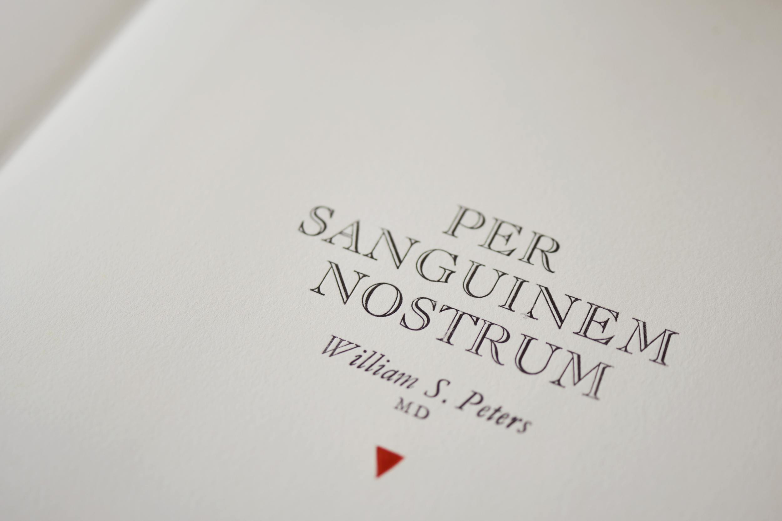
Through our blood
In a preface to his treatise about the discovery, Per Sanguinem Nostrum (Through Our Blood), Dr Peters says he was taught a good living heart is one that, when looked at end-on at the apex, “twists like a hypnotist’s trick, swirling seemingly without a start to the spiral as it tightens and twists with every tick.”
“When you look at the biochemistry and the physics of the blood, it is a closed, repeatedly-switching, electromagnetic-driven circuit,” says Dr Peters.
Splicing a second loop into the single loop is a gradual process, but environmental change helped facilitate the upright, human form.
His model pointed at a transitionary state, a mixed circuit, that is less efficient, yet retains its balance bilaterally. This is why all animal life is bi-symmetric, he says.
Transitionary animals such as salamanders and reptiles have a less efficient system. They need a warm environment for their circulatory systems to evolve. When global warming ended the ice age, salamanders and reptiles occupied a transitionary state in the evolution of the circulatory system.
Phi
The five limbs that sprout out of vertebrates’ trunks were determined by another evolutionary principle found in Dr Peters’ model.
During an earlier investigation of the twisting function of the heart, he found the design of its flow-path was based on the logarithmic spiral. Known as phi, the self-similar spiral growth curve has fascinated mathematicians, scientists, artists, architects, designers and natural philosophers for centuries. It can be found in the nautilus sea-shell and in the architecture of the Athenian temple Parthenon.
Because the smallest part of the design shares exactly the same proportions as the whole, the curve evolves in humans, but proportionally, from the centre (the heart) to the extremities.
To render the human heart’s logarithmic spiral in 2D, he used digital data captured from the most advanced MRI technology from Germany. The “ghostly soft-shell form” in the image was of the interior of a human heart’s tubes and chambers.
“Spheres were placed in the soft-shell form and the centre-point of each sphere was used to ‘join the dots’ to create a singular white line that distils the essence of the form of the distributive motor within humans,” Dr Peters told The Gisborne Herald in 2013.
The white line drawn through the centre of each virtual ping-pong ball describes a ragged but definite logarithmic spiral.
In geometry, phi generates a five-pointed star known as the pentagram. Phi is also found in a mathematical principle known as the Fibonacci Series. This is achieved by adding each number to its previous sum of numbers.
For instance: 1+2=3, 2+3=5 and so on.
The logarithmic spiral found in the design of the heart radiates pentamerically. That is, the spiral evolves organically to configure itself at the extremities of the body in fives.
As an emblem of this principle, Dr Peters draws on Renaissance artist-scientist Leonard da Vinci’s famous drawing Vitruvian Man. The picture depicts a man standing inside a circle and square. Based on another translation of phi known as the golden section, the proportions of his body match a Classical ideal.
Dr Peters produced a print on metallic paper and wrote a concise summary of his discovery — but he knew he would have to expand it. He shelved the scientific pursuit of his idea for a while. Then he came back to it, armed this time with a vacuum cleaner hose.
Report by Mark Peters, Gisborne ©2015
Invitation to the Humbug Talk, City Gallery Wellington
Talk: Humbug, a Dialogue Between Painting and Architecture
Painter Peter Adsett and architect Sam Kebbell continue their ten-year dialogue on painting and architecture, including their collaborative design of Humbug, a house and studio for Adsett’s family in Australia – architectureau.com
In association with CITY GALLERY WELLINGTON, Aaron Lister and Demented Architecture.
Date: 18 October 2015
Time: Sunday, 2pm
Cost: Free
Civic Square
101 Wakefield St
Wellington
New Zealand
In 2009, Adsett built a house/studio in southern Victoria that was the fruit of another collaboration, this time with a New Zealand architect, Sam Kebbell. The innovative and much admired building (now housing Adsett and his family) is regarded as a “dialogue between painting and architecture.”
For more information about Peter and his work contact the Gallery.
Gisborne Gallery Going Global
ARTS - IN Gisborne last year to visit local gallery owner Matt Nache, the director of the Sydney Contem-porary art fair pronounced himself perplexed.
“While it seems you are in the middle of nowhere, you are right in the thick of things on the global stage,” Barry Keldoulis said. “How on earth do you get artists and patrons to follow you from where you are?”
Big question that, and one Nache has been working to answer since he first opened his PaulNache gallery more than a decade ago.
And it is one he will get the chance to answer when he next week takes part in the Sydney Contemporary panel discussion From The Edge: Art From The Pacific Rim.
Joining four other gallery directors — two from major Sydney institutions, one from Chile and one from Jakarta — Nache will be part of next Friday’s dialogue about how artists and art enthusiasts on the geographical fringes can feel connected to the “global engine of creativity”.
He says he’s excited about the opportunity to step on an international stage to talk about the challenges he faces every day in his little corner on the world.
But art fair attendees may want to look rather than listen: when Nache lands in Sydney on Sunday his entourage will not only include exhibiting artists and their crew.
Also on board will be gallery supporters, among them high-profile New Zealand arts patrons Sir James Wallace, Chris Parkin and Fiona Campbell.
And the day before the four-day event opens, Sydney gallery M Contemporary will host a breakfast to bring together the PaulNache/M Contemporary artists and supporters.
“That’s actually how you do it,” he says in reference to the PaulNache entourage of workers and supporters.
“Everything you do has to be about relationships — with artists, with patrons, with other arts professionals — to ensure your artists get the best opportunity for career development and international profile.
“But for us it’s actually more than that. These are people whose company I genuinely enjoy, and who I really look forward to introducing to new things.”
Even once those relationships have been established, it is hard for small galleries like PaulNache to get noticed among their larger, richer contemporaries who will be jockeying for attention among the 30,000 art lovers and collectors that turn up to see Sydney Contemporary’s 90 galleries from 13 countries.
So Nache says he’s committed to working smarter, going into events like Sydney Contemporary and next year’s Hong Kong Art Central with both great art, and a strategic plan of attack.
In terms of the art, he’s showing performance, painting, installation and photographic works by Matt Couper, Peter Adsett, Glen Hayward and Sanjay Theodore, with Couper’s live printing demonstrations — which he’ll do dressed as classic vampire Nosferatu — tipped to be an attention getter.
In terms of the plan, he’s applying the techniques he has developed operating from the isolated East Coast of New Zealand.
Social media is a big part of that, and not just a few tweets and Facebook updates. PaulNache invests heavily in professional video and still photography to ensure its posts look as good as its art.
“But research shows that many visitors engage more readily with physical material so for this we’re providing printed material like catalogues and postcards, as well as promotion through international art magazines.”
Getting the attention of the arts and mainstream media is important and Nache has already scored a coup by getting Hayward’s unnervingly realistic installation (I Don’t Want You to Worry About Me, I Have Met Some Beautiful People) profiled by Blouin ArtInfo, which has an on-line readership of millions.
Sydney Contemporary is not Matt Nache’s first big art fair — he sees them as a key part of ensuring his artists get seen on the global stage — but it’s the first one he’s attended with Creative New Zealand support “and that’s massive”.
“I was told getting that funding was really difficult and my application was made with that knowledge, so to have succeeded in getting Creative NZ support feels like a really important form of validation,” he says. “It’s pretty nerve-racking having your work come under that kind of scrutiny so to have them say that what I am doing from Gisborne is right is a really huge thing.”
- PaulNache is exhibiting at Sydney Contemporary, September 10-13
- Upon returning to Gisborne, the gallery team on September 18 (6pm) opens the new exhibition Nosferatu & the Spider Woman, works by Matthew Couper and JK Russ.
Gisborne Herald, Thursday, September 3, 2015 by Kristine Walsh
Leading from the Edge - Art From the Pacific Rim
Speakers: SUHANYA RAFFEL (Director of Collections at AGNSW), IRENE ABUJATUM (Director of Fundación FAVA and Director of Feria ch.ACO, Chile), MATTHEW NACHE (Director of Paul Nache Gallery, New Zealand), LEO SILITONGA (Our South East Asian VIP Liaison, Director of Art Jakarta), DR GENE SHERMAN AM (Chairman and Executive Director of Sherman Contemporary Art Foundation).
Traditionally Venice, Florence, Paris and New York have been considered the leading centers for artistic creativity. Now you can live life as an artist or an art enthusiast in almost many major city and feel connected to the engine of creativity. How has this transpired and what does it mean in terms of production, engagement and marketing art? This discussion touches on how emergent economies have provided new collectors, institutions and philanthropists that support new networks of creative growth.
Venue: Sydney Contemporary, Carriageworks - Friday, 11th September 3:30-4:30 pm
Sneak peak: Installation Contemporary at Sydney Contemporary 2015
Glen Hayward's 'I Don’t Want You to Worry About Me, I Have Met Some Beautiful People', 2012, Photo: Hamish MacLauren, courtesy of the artist and PAULNACHE, Gisborne, NZ
Sydney Contemporary, Australasia’s international art fair, has revealed details of the Installation Contemporary sector of this year’s fair which will take place at the Redfern-based multi-arts centre Carriageworks from September 10-13, 2015.
Curated by The Curators’ Department, a Sydney-based independent creative agency, Installation Contemporary 2015 comprises 18 immersive, interactive, and site-specific artworks situated throughout the Fair’s 10,000 square metre footprint.
Drawing inspiration from Carriageworks’ towering heights, hidden corners, and evocative spaces, The Curators’ Department have commissioned an exciting array of works by a diverse group of both established and emerging artists.
“Driving the project is an investigation into artists’ approach to materials and how, through the installation format, they are able to induce a broader sensory experience and transform the perception of self and space,” state the curators in their notes.
Works to look out for include Alex Seton’s pile of cast marble composite paddles, Gregor Kregar’s purpose-built wood and neon structure, Glen Hayward’s recreation of the office cubicle from “The Matrix,” Gunjan Aylawadi’s paper tapestry, Caroline Rothwell’s interactive “Weather Maker,” and Vicky Browne, Simon Reece, and Darren Seltmann’s collaborative installation “Conversations with Plants.”
The artists participating in Installation Contemporary 2015 are: Tony Albert with Stephen Page, Gunjan Aylawadi, Vicky Browne with Simon Reece and Darren Seltmann, Ham Darroch, Scott Eady, Helen Eager, Glen Hayward, Gregor Kregar, Justine Khamara, Laith McGregor, Christine McMillan Callum Morton, Mylyn Nguyen, Stephen Ralph, Brian Robinson, Caroline Rothwell, and Alex Seton.
BY Nicholas Forrest | August 30, 2015 | View link
I Don't Want You to Worry About Me, I Have Met Some Beautiful People
Real or illusory? Virtual or physical? Sculptor Glen Hayward teases out these questions in this mind-bending new sculpture, a hand-carved and painted recreation of the famous office cubicle from The Matrix. From the ring binders to the telephone to the pencils in a coffee mug, everything here – like everything in the world of the film – is not quite what it seems.
Hayward's installation I don't want you to worry about me, I have met some Beautiful People was created during the artist's residency at the Rita Angus Cottage in 2012.
In addition, sculptor Glen Hayward and City Gallery Wellington curator Aaron Lister will have a discussion about Hayward's installation I don't want you to worry about me, I have met some Beautiful People as part of SCAF VIP programme.
It is important to note that The Matrix (1999), was filmed at Fox Studios in Sydney, Australia, and in the city itself, although recognizable landmarks were not included in order to maintain the impression of a generic American city. The filming helped establish New South Wales as a major film production centre (https://en.wikipedia.org/wiki/The_Matrix).
ARTWORK CREDIT:
Glen Hayward
I Don't Want You to Worry About Me, I Have Met Some Beautiful People
Wood, paint.
340 x 220 x 170 cm
Courtesy the artist and PAULNACHE, Gisborne, New Zealand
Available - Price on application
Photography by Hamish McLaren
Biography
Glen Hayward is known for his sculptures of everyday, mass-produced items. Carved from wood and painted exactly as they were as found objects, they masquerade as the real. Hayward completed his doctoral dissertation at Auckland University's Elam School of Fine Arts in 2005.
Recent solo shows include: Sign Field, PAULNACHE (2014); “I don't want you to worry about me I have met some Beautiful People”, City Gallery Wellington and Christchurch Art Gallery Te Puna o Waiwhetu (2013); Mirrorworld, McCahon house open studio, Auckland Arts Festival (2011).
Group shows include: Lying in Space, 30upstairs (2014); The Obstinate object, curators Aaron Lister and Abbey Cunnae, City Gallery, Wellington (2012); Debuilding, curator Justin Paton, Christchurch City Gallery Te Puna o Waiwhetu,Christchurch (2011); Call Waiting, curator Alexa Johnston, Auckland City Art Gallery (NEW), Auckland (2010); Reboot, The Jim and Mary Barr Collection, curator Justin Paton, Dunedin Public Art Gallery, Christchurch Art Gallery and Wellington City Gallery (2006-2007).